
Wired Local Marketing logo

Case Study

Whitehouse Electric LLC

Website redesign for a Georgia-based electrical contractor — a modern, mobile-first site built to make it easier for homeowners and businesses to find, trust, and contact the company.

Client

Whitehouse Electric LLC

Industry

Electrical Contractor

Scope

Website Redesign · Web Design · Conversion · Local SEO

The Challenge

A capable electrical contractor with a website that wasn't doing the work.

Whitehouse Electric LLC is a veteran-owned, licensed and insured electrical contractor serving Southeast Georgia. The team's reputation, work quality, and reviews were strong — but the previous website didn't reflect any of it.

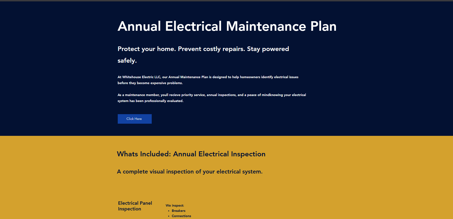
The homepage was built around a single flyer-style graphic instead of real, tappable content. The contact form asked for four generic fields with no phone number or job description. Trust signals — veteran ownership, licensing, 5.0 rating — were buried on a separate About page that included typos and awkward formatting. And on mobile, where most electrician searches happen, the site simply didn't reflow.

The result: a business that customers would trust in person, represented online by a site that made it harder than it should be to call, request an estimate, or figure out what services were even offered.

What We Built

A modern, mobile-first site with the phone number, form, and trust signals where they belong.

  • Location-specific homepage H1 targeting 'Electrical Services in Southeast Georgia'
  • Above-the-fold lead form with property address and job description fields
  • Persistent tap-to-call button in the navigation and hero on every page
  • Trust bar with veteran-owned, licensed & insured, 5.0 rating, and residential + commercial cues
  • Residential vs. Light Commercial service split with typed cards and real descriptions
  • Dedicated Services, Service Area, Reviews, FAQs, and Contact pages with structured content
  • Redesigned contact page grouping call, email, address, hours, map, and form in one clean column
  • Mobile-first responsive build tuned for thumb navigation and fast load on 4G
  • On-page SEO foundations: unique titles and descriptions, semantic headings, service-area targeting

Before & After

The redesign, section by section.

Every comparison below pairs the original page with the redesigned equivalent on whitehouseelectricllc.com, with a short breakdown of what changed and why it matters for a homeowner or business trying to hire an electrician.

Homepage

Before
Whitehouse Electric Homepage — before redesign
After
Whitehouse Electric Homepage — after redesign

Before

The original homepage relied on a single flyer-style graphic — a large marketing image with the offer, phone number, and service list baked into the artwork. Visitors couldn't tap the phone number or the service items, there was no real form above the fold, and the page didn't adapt to search intent.

After

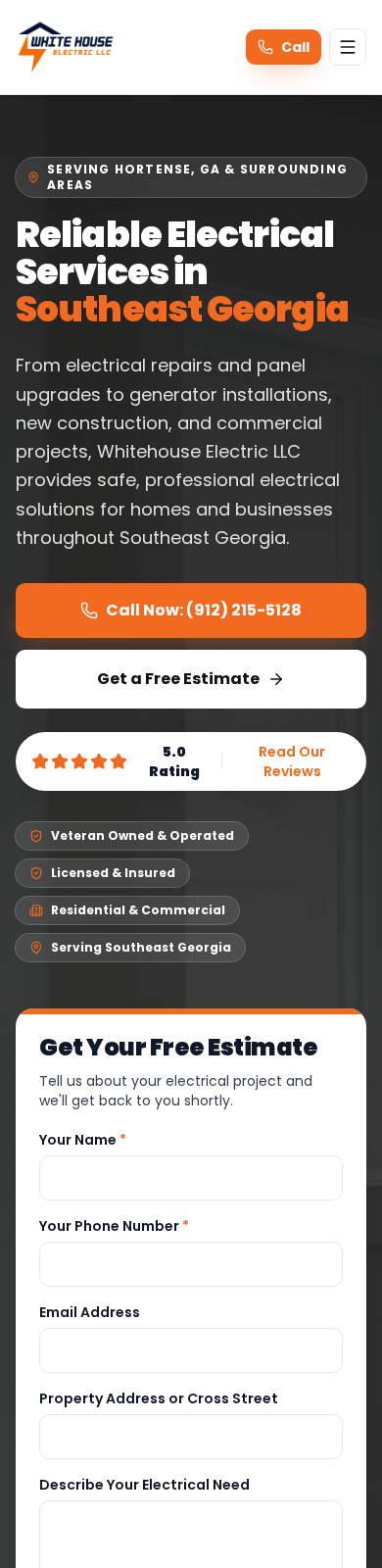
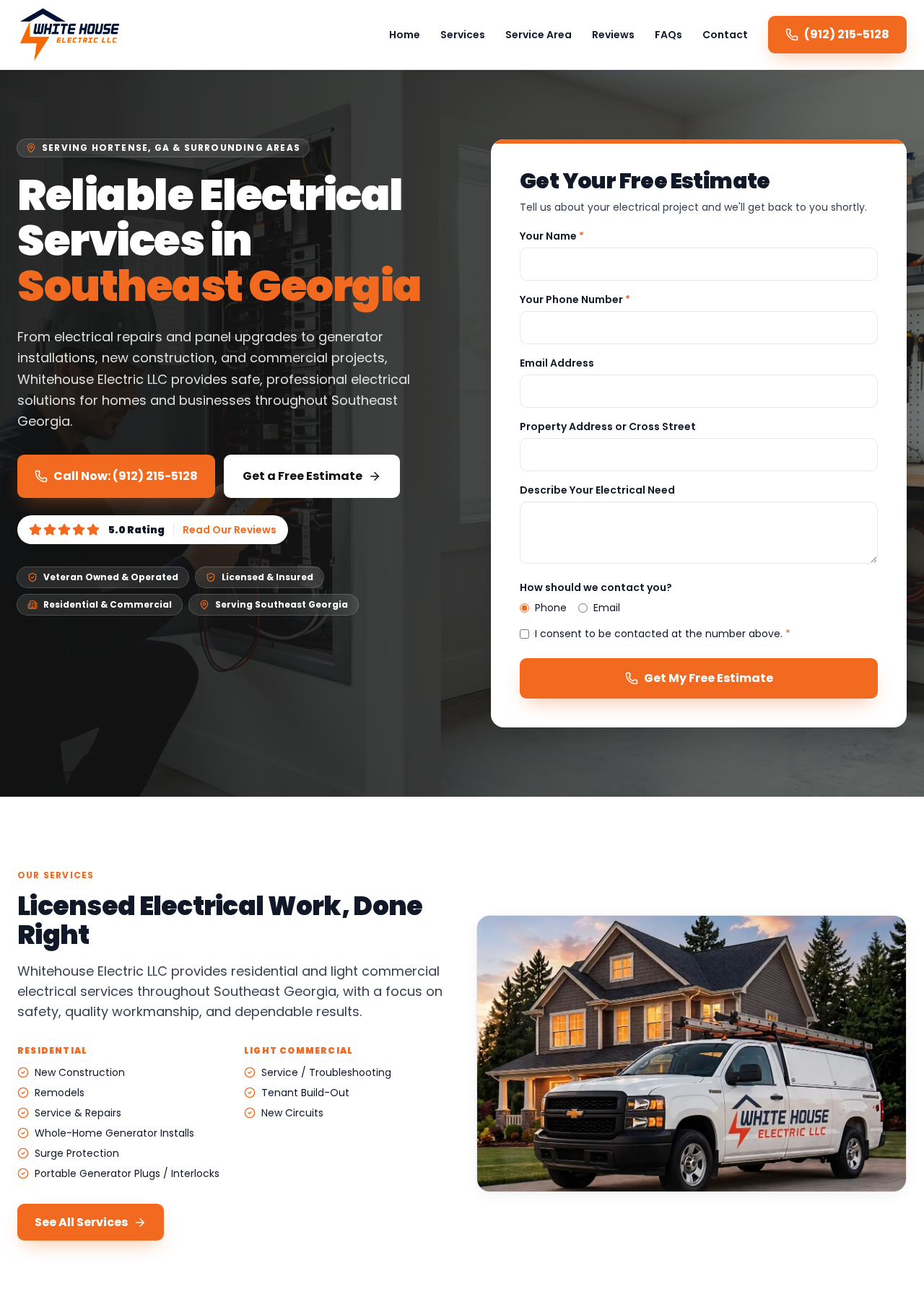
The redesigned homepage leads with a clear location-specific H1, a scannable value proposition, and two primary actions side by side — a tap-to-call button and a request-a-quote CTA. A structured lead form sits directly in the hero, and trust cues (veteran owned, licensed & insured, 5.0 rating) are broken out as real HTML so they contribute to SEO and accessibility.

Why this matters

Homeowners searching for an electrician decide in seconds. Turning the offer, phone number, and form into real, tappable elements above the fold removes friction from the two actions that actually generate jobs: calling and requesting an estimate.

Homepage — services section

Before
Whitehouse Electric Homepage — services section — before redesign
After
Whitehouse Electric Homepage — services section — after redesign

Before

Services were introduced with a headline pinned to one metro area and a paragraph of dense body copy. There was no visual grouping between residential and commercial work, and the layout gave every item the same weight.

After

The new homepage services block splits work into Residential and Light Commercial columns with icon-marked checklists, then reinforces the offering with a lifestyle image of the branded service truck. A single 'See All Services' CTA routes visitors deeper without overwhelming the scan.

Why this matters

Most visitors self-identify as either a homeowner or a business owner. Letting them see their category on the homepage — instead of reading a wall of text — builds relevance instantly and pushes qualified traffic to the right service page.

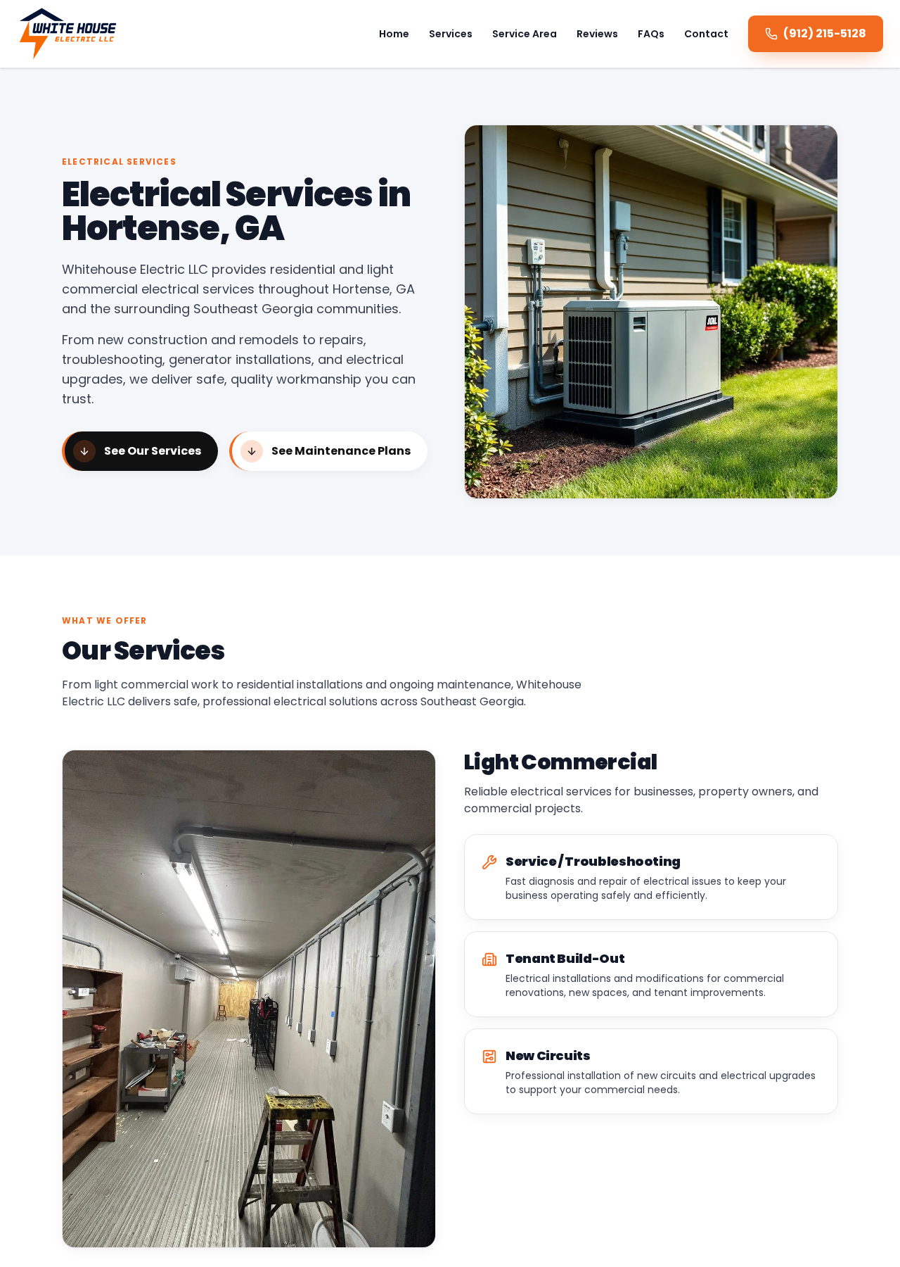
Services page

Before
Whitehouse Electric Services page — before redesign
After
Whitehouse Electric Services page — after redesign

Before

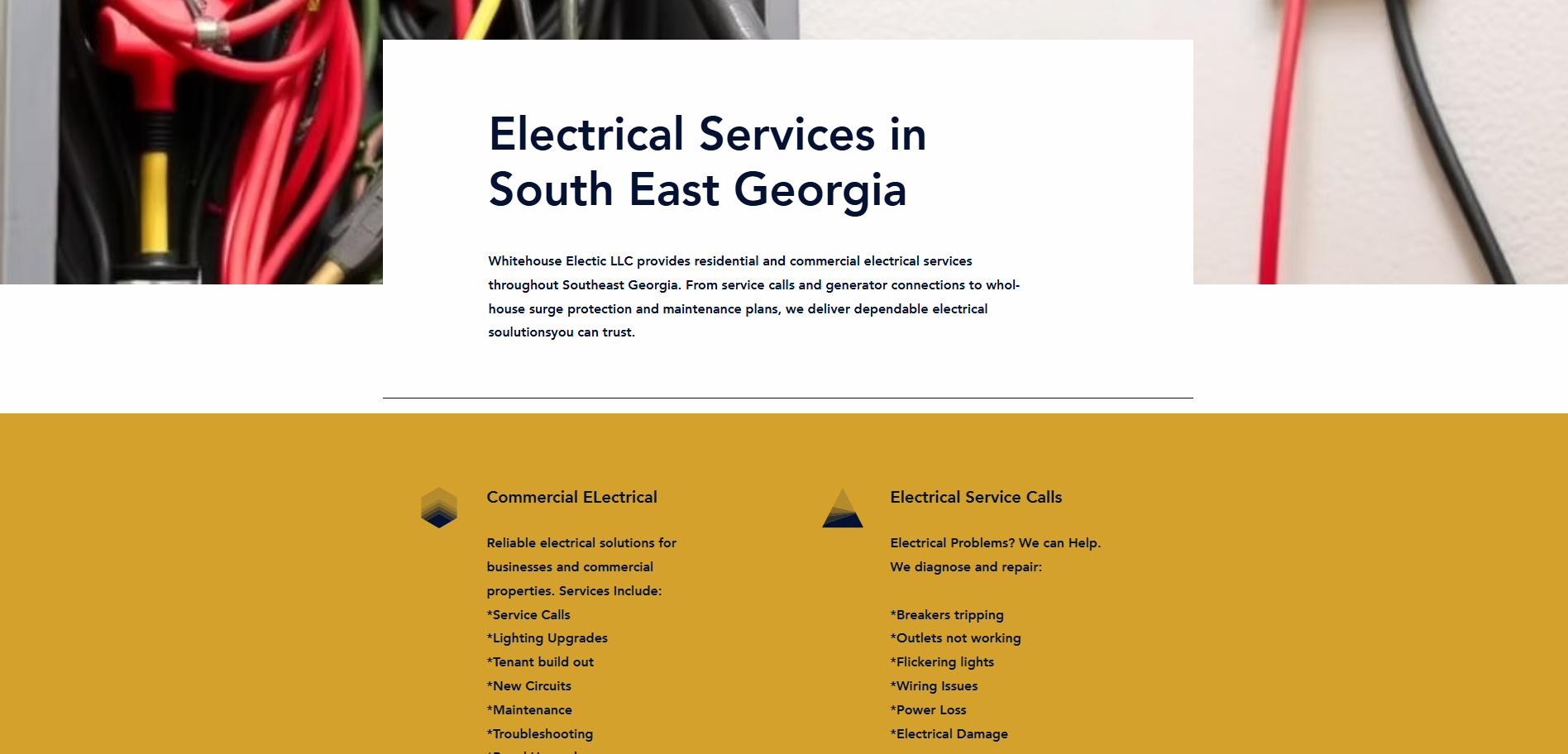
The original services page listed offerings as asterisked bullet lists on a flat yellow background. Categories ran together, there were no supporting descriptions, and nothing on the page directed a visitor toward booking work.

After

The redesigned services page opens with a location-specific H1 and a supporting hero image, then organizes offerings into typed cards (Residential vs. Light Commercial) with icons, descriptions, and CTAs to services and maintenance. Every service reads like something a customer can actually request.

Why this matters

A services page has to do two jobs at once: rank for service-plus-city keywords and convert. Structured content, image support, and clear category cards handle both — the copy is crawlable, and the layout guides the visitor toward the next step.

Contact page

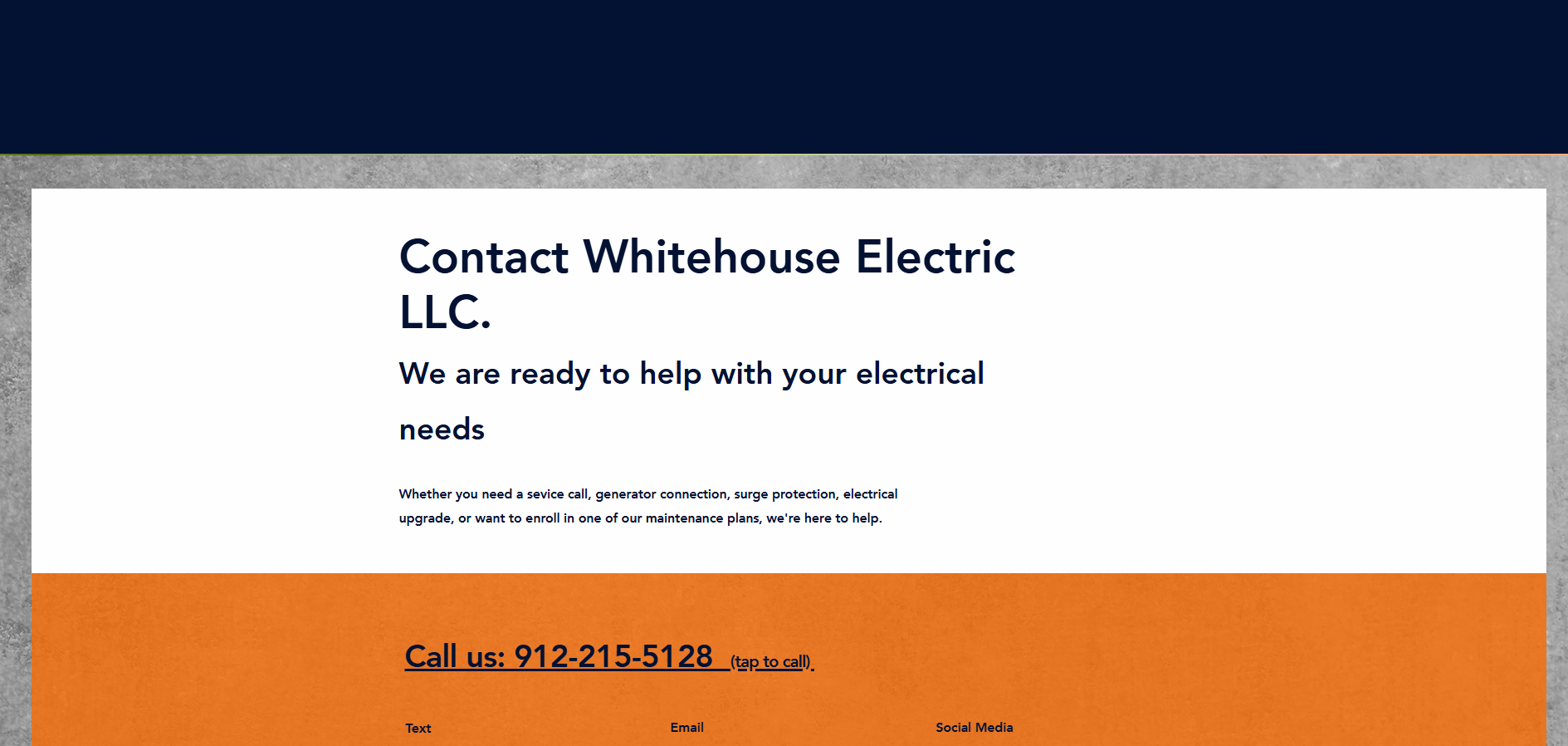
Before
Whitehouse Electric Contact page — before redesign
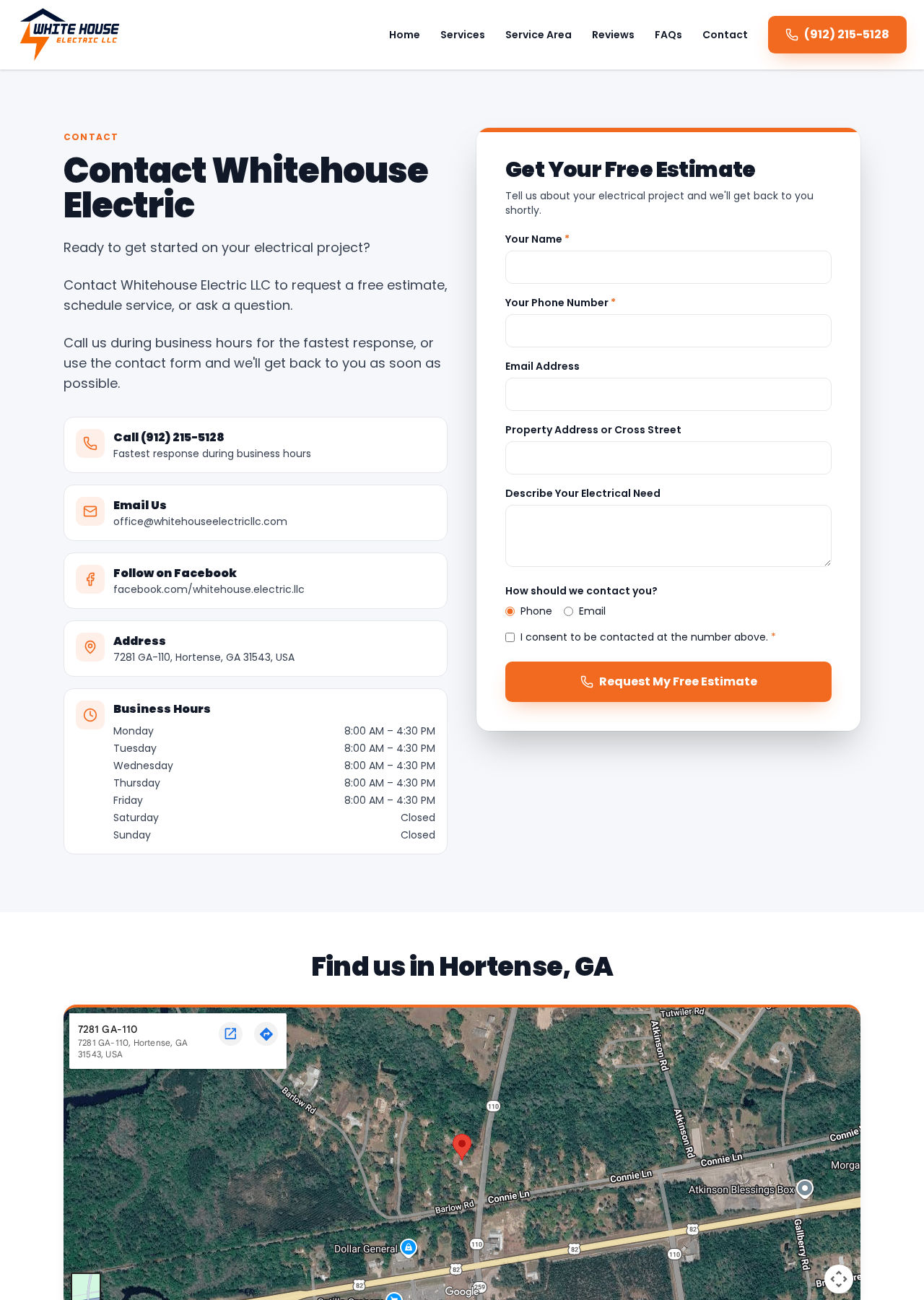
After
Whitehouse Electric Contact page — after redesign

Before

The original contact page opened with the business name as the H1 and a paragraph of body copy before any way to actually contact the business. Phone, email, hours, and the form were scattered across two visually mismatched color blocks.

After

The new contact page leads with a clear 'Contact Whitehouse Electric' headline and a supporting sentence, then stacks the four things a visitor actually needs — call, email, follow, address — as icon rows next to a full estimate form. Business hours are formatted as a real HTML table.

Why this matters

A contact page's only job is to make the next step effortless. Grouping call, email, address, hours, and the form in one clean column removes the guesswork and gives visitors multiple, tappable ways to reach the business.

Contact form

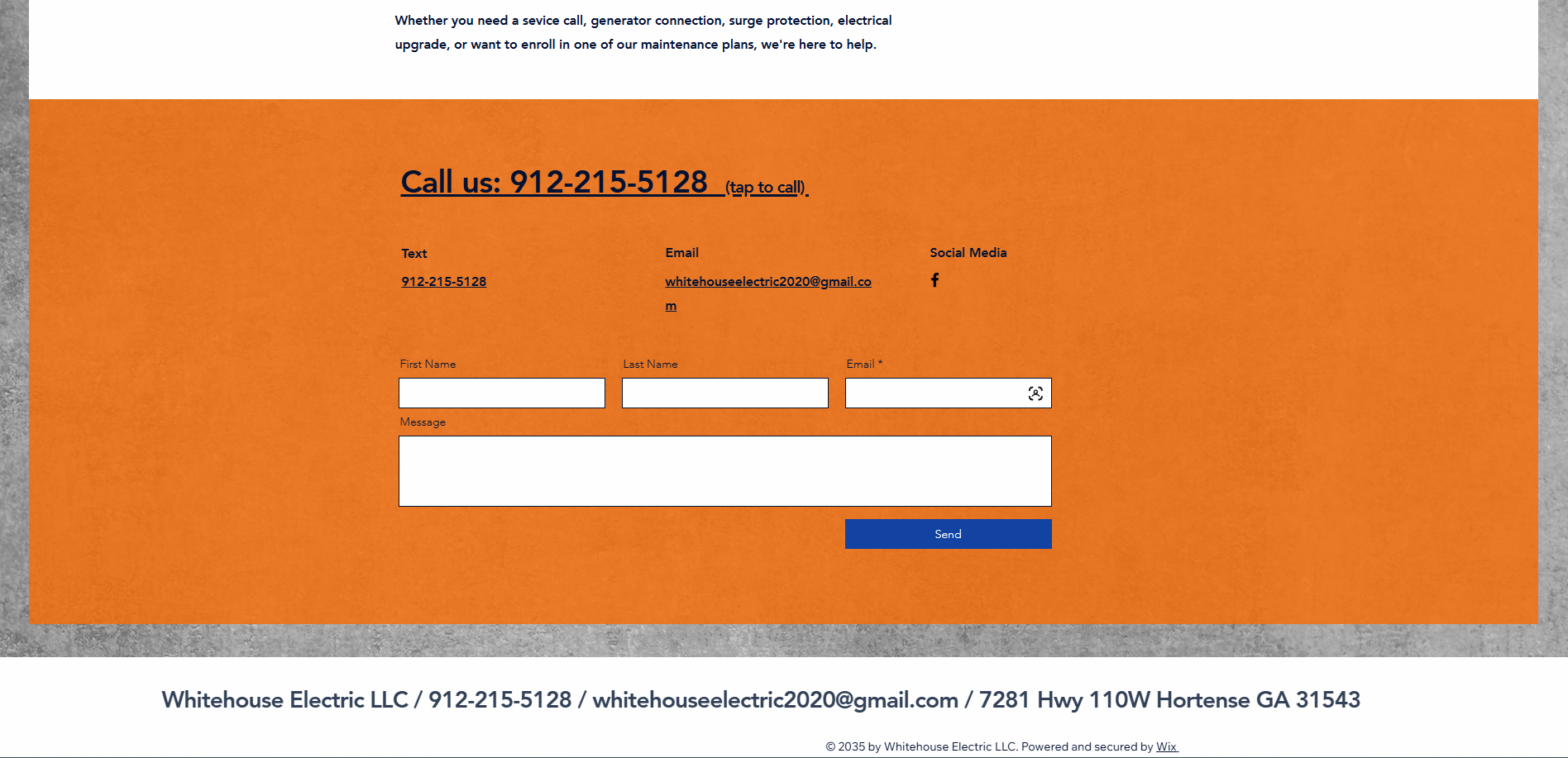
Before
Whitehouse Electric Contact form — before redesign
After
Whitehouse Electric Contact form — after redesign

Before

The original form asked for First Name, Last Name, Email, and a Message — no phone number, no context about the job, and no consent language. Leads came in with almost none of the information needed to quote or route the work.

After

The redesigned form captures name, phone, email, property address or cross street, and a description of the electrical need, plus a preferred contact method and a consent checkbox. Required fields are marked and the submit button reads 'Request My Free Estimate' — an action, not a generic 'Send'.

Why this matters

A form is only useful if it produces bookable leads. Capturing address and job description up front means the contractor can prioritize, route, and quote without a second back-and-forth email — and the consent language protects the business.

About section

Before
Whitehouse Electric About section — before redesign
After
Whitehouse Electric About section — after redesign

Before

The old About page led with a stock outlet-repair photo and a headline containing typos ('Powering Dreams. Delivering Reliable Elctrical Solutions.'). The story copy sat on a dark navy block with mixed formatting and awkward line breaks that hurt readability.

After

The new site folds the business story into the homepage and services page, where trust signals — veteran owned & operated, licensed & insured, residential & commercial, 5.0 rating, real Facebook reviews link — sit next to the primary conversion actions instead of on a separate page most visitors never reach.

Why this matters

Trust is what turns a visitor into a caller. Placing veteran ownership, licensing, and real review counts next to the phone number is more persuasive than a dedicated About page — and it means the trust signals show up on the pages visitors actually land on.

Maintenance plans

Before
Whitehouse Electric Maintenance plans — before redesign
After
Whitehouse Electric Maintenance plans — after redesign

Before

The old site marketed two annual maintenance plans ($199 and $299) as a separate page with mixed typography, inconsistent capitalization, and abstract icons that didn't communicate what a customer would actually receive.

After

Maintenance and generator-adjacent services are now integrated into the services page under the residential column (whole-home generator installs, surge protection, portable generator plugs / interlocks). Plan-style offerings can be re-introduced as a productized page later without competing with the core service messaging.

Why this matters

Selling maintenance plans works best after a customer has already trusted you with a service call. Leading with the core services first — and reserving productized plans for a follow-up page — keeps the homepage focused on the visitors most likely to convert today.

Mobile experience

Before
Whitehouse Electric Mobile experience — before redesign
After
Whitehouse Electric Mobile experience — after redesign

Before

Because the old homepage was built around a single graphic, the mobile experience was effectively a zoomed-out flyer — the phone number and CTAs weren't tappable, and the layout didn't reflow to phone widths where the majority of local-service searches happen.

After

The redesigned site is built mobile-first: the hero collapses to a single readable column, the call button and estimate form sit within thumb reach, and typography, spacing, and images all reflow cleanly at phone widths.

Why this matters

Google reports the majority of 'electrician near me' searches happen on mobile. A site that only works on desktop loses the exact traffic an electrician most wants to capture — a mobile-first build turns those searches into calls.

Why It Works

The design decisions behind the redesign.

  • Clarity over cleverness

    One clear H1 per page, one primary action per section, no competing hero images fighting for attention.

  • Two primary CTAs, not five

    Every important page pushes toward the same two actions — call now or request an estimate — so visitors never have to decide what to do next.

  • Trust where the decision happens

    Veteran-owned, licensed & insured, and 5.0-rating cues sit inside the hero, not on a separate About page.

  • A form that actually qualifies leads

    Property address, job description, preferred contact method, and consent — so the contractor can quote without a second email.

  • Mobile-first by default

    Every layout is designed for a phone first, then scaled up — which is where the majority of local-service searches convert.

  • SEO foundations, not gimmicks

    Location-specific headlines, semantic HTML, dedicated service pages, and clear internal linking give the site the structure Google needs to rank it.

Project Outcome

A foundation the business can market against.

The redesign gives Whitehouse Electric LLC a website that finally matches the quality of the work in the field — a professional, mobile-first presence that makes it obvious what the business does, where it operates, and how to hire it.

Just as importantly, the new site is built to be marketed. Structured service pages, a location-specific homepage, semantic headings, and a real contact form give Google Ads, local SEO, and reputation-management campaigns something they can point at and convert against. What was a static flyer is now a working piece of business infrastructure.

You can see the live site at whitehouseelectricllc.com.

Let's Work Together

Ready to fill your pipeline with qualified jobs?

One free 30-minute strategy call. We'll give you a straight read on your online presence and what it would take to fix it. No pitch. No pressure.

Book a Free Strategy Call